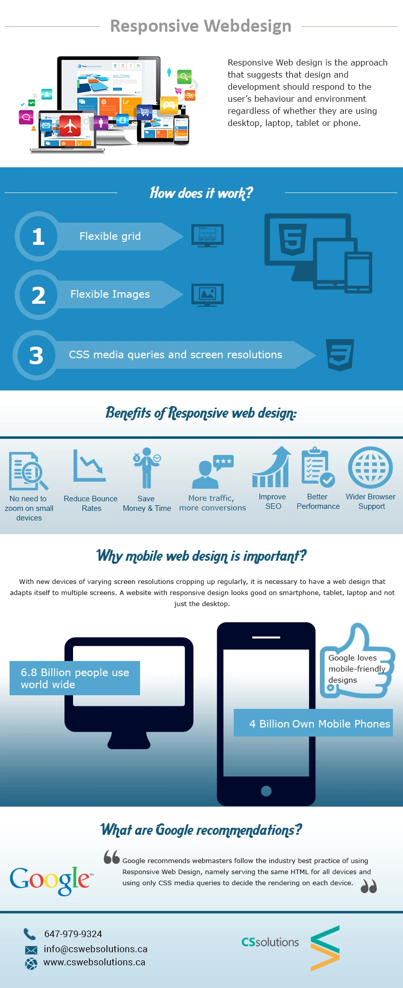
No matter what type of device is been used to view a website, responsive web design ensures that users are having a good viewing experience with the device they are using. The explosion of smartphones has slowed up traditional PC sales. Moreover, Responsive website development has become increasingly important. Plus, Responsive Mobile-friendly websites are prioritized even in Google’s search engine algorithm.
Well, it is a method of creating a web page that tips the scale according to the device the page is seen through. It involves a mixture of images, flexible grids, layouts and neat use of CSS media queries.
As the user switches from desktop to mobile or any other device the website immediately gets even with the image size, resolution and content. It has a technology that responds automatically to the user’s preferences.
How does Responsive Web Design Works?
Responsive websites work on fluid grids. Each element is sized proportionally, allowing the layout to adapt smoothly across different screen sizes and devices. For example, if there are three columns, designers define the width of each in relation to the others. Images are also resized relatively so they fit perfectly within the columns and overall design structure. To see real examples of modern responsive layouts in action, you can explore our Website Design Portfolio and discover how responsive web design improves user experience and functionality across all devices.
Benefits of Responsive Web Design
Responsive Website presents an optimized experience for the users. Responsive design has only one version of the site when updates are required. All the content and/or images are set out in the same place. This makes the entire project for any developer a lot simpler.
Usability is another benefit of Responsive Web Design. It ensures that your business website looks feels and works great on any size or type of device your customer and potential customers are using. Responsive sites are advantageous for SEO as well since indexing your website becomes very easy for Google.
Why is Mobile First Design Important?
If you check your traffic, you will experience that most visitors are viewing your website through their mobile devices. The concept of, responsive website, if implemented correctly, improves the user experience.
Moreover, being a business owner, you will need to accept new technologies, resolutions, and devices on a regular basis. Remember, technology keeps evolving, and your website should evolve with it to maintain a seamless user experience. Reviewing Case studies of website development can help you understand how modern businesses adapt their websites to changing technologies, improve responsiveness, and enhance overall performance for users across different devices.
A responsive website is beneficial not only for developers but also for users. As businesses evaluate mobile-first or responsive design approaches, responsive websites have become a major trend in recent years. CS Web Solutions is one of the leading responsive website development service providers.
Our services are a perfect mixture of HTML5, CSS3, and JavaScript. A website can to customized for people using PC Desktops or Laptops, it can be customized for people using gadgets currently into a trend, and moreover, it can also be customized for people today’s advanced gadgets. A Responsive website, in this way, sets a great experience for everyone. And we, as Web Developers, always strive to achieve this.